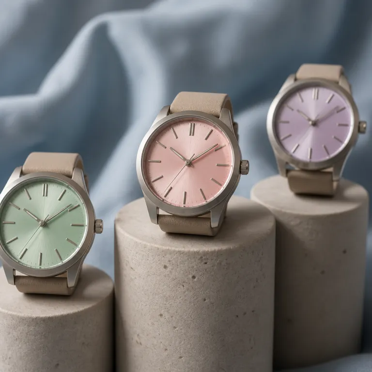
Section 1 – Why watch dial color trends 2026 matter more than the hype
Every serious watch collector eventually learns that dial colors age very differently. A shade that feels like the best thing on Instagram today can look tired on a luxury watch after a decade of real wear, especially when the dial color fights the case and bracelet. When you study watch dial color trends 2026 carefully, you start seeing which dials are built on solid design principles and which are just chasing a short lived watch trend.
The current palette of green, salmon, burgundy and orange did not appear overnight. These dial colors evolved from years of experimentation on limited editions, then filtered into mainstream watch trends once brands saw how collectors reacted to each dial color in steel, gold and two tone cases. The real question for a luxury watch buyer is not which dial looks most popular this season, but which dial colors will still feel coherent with your wardrobe and skin tone when your mechanical watches have gone in for their third full movement service.
Green dials are now fully established, from the Rolex Oyster Perpetual to more discreet dress watch pieces by Jaeger LeCoultre. Salmon dials ride on vintage associations from mid century Patek Philippe chronographs and sector dials, while burgundy dials quietly offer a dial warm enough to behave almost like a neutral in low light. When you analyse watch dial color trends 2026 through this lens, you see that black dials and white dials remain the anchor points, and the more saturated dial colors orbit around them as accents rather than replacements.
Section 2 – Green, salmon, burgundy and black: how the new palette really wears
On the wrist, green is no longer a novelty color for a single weekend watch. A deep green dial on a steel case can read almost black indoors, then show rich dial colors in sunlight, which is why many collectors now treat green dials as daily wear options rather than occasional pieces. When you compare watch dial color trends 2026 across brands, you notice that the most successful green dials lean slightly muted, avoiding neon tones that look great in photos but harsh in office lighting.
Salmon dials are more nuanced, especially on a luxury watch with white gold or rose gold hands and markers. The best salmon dials balance a dial warm enough to echo vintage Patek Philippe and Vacheron Constantin pieces, yet cool enough that the color does not clash with a navy suit or grey knitwear during day watch use. Burgundy dials sit between black dials and bright red dials, and this makes them surprisingly popular among collectors who want dial watches that feel different but still restrained in conservative environments.
Black remains the control group in any discussion of dial colors. A black dial on a Rolex Oyster Perpetual or a Jaeger LeCoultre dress watch will always be easier to pair with formal wear than a saturated green dial, which is why black dials still dominate sales even as watch trends push color. If you are considering a women’s automatic piece with a crystal case and coloured dial, a transparent luxury watch with a restrained dial color can give you the visual interest of color without locking you into a loud palette.
Section 3 – Rolex, Patek Philippe and the premium on coloured dials
When collectors talk about watch dial color trends 2026, they usually start with Rolex. The Rolex Oyster Perpetual line turned green, yellow and turquoise dials into cultural objects, and some of those dial colors now trade above retail on the secondary market because supply is constrained and demand is global. A green dial on a Rolex Oyster case is not just a color choice ; it is a signal that you are buying into a specific moment in watch trends, with all the risk and reward that implies.
Patek Philippe approached colored dials more cautiously, often pairing blue green or olive green dials with white gold or rose gold cases on limited references. Those Patek Philippe dial colors sometimes command premiums because they combine a respected movement with a dial color that appeared only briefly in the catalogue, which makes them feel scarce to collectors. The same logic applies to black dials with subtle sunburst finishes, where a seemingly simple dial design hides a level of finishing that separates a true luxury watch from a fashion piece.
For a first serious mechanical watch, you do not need to chase the most popular dial watches on the market. A well proportioned steel case with a green dial or burgundy dial can feel special without relying on speculative pricing, especially if the movement is robust and easily serviced. If you want to test how a bold green face behaves in daily wear before committing to a grail piece, a chronograph with a green dial and white strap can be a low risk way to understand how that color interacts with your wardrobe.
Section 4 – Finishing over fashion: why enamel, guilloché and lacquer outlast trends
Color alone never makes a dial feel truly luxurious. What separates enduring watch dial color trends 2026 from forgettable experiments is the way brands apply color over specific dial designs and textures, especially when working with grand feu enamel, guilloché under translucent enamel, or high quality lacquer. A green dial in flat paint can look cheap after a few years, while a green dial over a guilloché base can age gracefully as light plays across the engraved pattern.
Grand feu enamel dials, whether in white, black, blue or dial warm tones like cream and salmon, offer a depth that printed lacquer dials cannot match. The firing process creates dial colors that resist fading and develop a subtle character over time, which is why many high end dress watch models from Jaeger LeCoultre and others still rely on enamel even when watch trends push towards more experimental finishes. When you run your eyes across a well executed enamel dial, the color feels integrated into the dial rather than sitting on top of it.
Guilloché dials covered with translucent enamel or lacquer work similarly, especially on white gold or rose gold cases where the metal tone complements the dial color. A burgundy dial with a sunburst or hobnail pattern can look almost black in low light, then reveal rich colors outdoors, giving you two watches in one without changing the movement or case. This is where dial watches with classic finishing quietly outperform louder pieces, because the underlying craft keeps the dial interesting long after the initial watch trend has passed.
Section 5 – Neutral tests, skin tone and wardrobe: choosing a colour you will still love
Before you commit to any strong dial color, run a simple neutral test. Ask whether the dial reads almost like a neutral in most lighting, or whether it only looks balanced in carefully staged photos, because real life wear exposes dial colors to office fluorescents, cloudy mornings and dim restaurants. Many green dials and burgundy dials pass this test better than bright orange or yellow dials, which is why they dominate watch dial color trends 2026 for collectors who actually wear their watches daily.
Skin tone matters more than most spec sheets admit. If you have warmer skin, a dial warm shade like salmon, champagne or certain green dials with a hint of olive can harmonise beautifully with rose gold or yellow gold cases, while cooler skin often pairs better with white dials, black dials and steel or white gold cases. Try the watch on in natural light, then under artificial light, and pay attention to whether the dial color flatters your skin or makes it look washed out.
Wardrobe is the final filter. If your daily uniform is navy, grey and white, a green dial or burgundy dial can function as the single pop of color, while a black dial or white dial remains the safest choice for strict business dress watch codes. Collectors who rotate several mechanical watches often keep one neutral dial for formal wear, one dial warm piece for weekends, and one experimental color that follows current watch trends without dominating the whole collection.
Section 6 – Evergreen versus trend picks: building a dial strategy for the next decade
Thinking in terms of strategy rather than impulse is how you make watch dial color trends 2026 work for you. Start by defining your evergreen dial picks, usually black dials, white dials or very dark blue dials on versatile cases, then layer in one or two dial colors that reflect current watch trends without locking you into a single era. An evergreen luxury watch with a clean dial and robust movement becomes the anchor, while a more colourful piece scratches the itch for novelty.
For many collectors, the evergreen slot is filled by a steel Rolex Oyster Perpetual, a Jaeger LeCoultre Reverso or a simple three hand Patek Philippe Calatrava, all with restrained dial colors. The trend slot might be a green dial sports watch, a salmon dial chronograph or a burgundy dial dress watch, each chosen with the understanding that it may be sold or traded as watch trends evolve. What matters is that the case, movement and overall design remain strong enough that even a trend driven dial color does not feel disposable.
Bracelets and straps also shape how dial colors read over time. A shell cordovan strap on a green dial or burgundy dial piece can tone down the color and make the watch feel more mature, which is why many connoisseurs treat a shell cordovan watch band as a daily luxury upgrade. In the end, the best dial watches are not the ones that shout the loudest in a press release, but the ones that still feel like you after ten years of scratches, services and stories on the wrist.
Key figures on coloured dials and long term appeal
- According to data from the Federation of the Swiss Watch Industry, Swiss watch exports with coloured dials beyond black and white grew from roughly 20 % of total volume in the mid 2010s to around 30 % of total volume by the mid 2020s, showing a clear structural shift towards more adventurous dial colors rather than a short term fad.
- Market analyses from major auction houses indicate that steel sports watches with uncommon dial colors, such as green or salmon, have achieved average hammer prices between 1.2 and 1.8 times their original retail prices in recent years, while equivalent models with standard black dials often remain closer to retail, highlighting the premium attached to rare dial colors.
- Surveys of collectors on large watch forums report that more than 60 % of respondents now own at least one green dial or blue green dial watch, compared with less than 30 % a decade earlier, confirming that green dials have moved from niche to mainstream in everyday wear.
- Industry reports from consulting firms tracking luxury consumption show that coloured dial watches under 10 000 USD have seen year on year sales growth in the high single digits, outpacing the overall mechanical watches segment, which suggests that aspirational buyers are using dial color as a primary way to express individuality.
- Data from major online retailers indicate that search queries related to watch dial color trends 2026 and specific terms like “green dial” or “salmon dial” have increased several fold over the past few years, reflecting how dial colors now drive initial interest before movement specifications or complications for many new buyers.
FAQ about watch dial color trends 2026 and long term style
Are green dials a passing fad or a long term choice ?
Green dials have moved beyond fad status and now appear across price points, from entry level mechanical watches to high end pieces from Rolex and Patek Philippe. The most versatile green dials use darker, muted tones that behave almost like black dials in low light, which makes them easier to wear daily. If you choose a restrained shade on a timeless case design, a green dial can remain relevant for many years.
How do I choose between a black dial and a coloured dial for my first luxury watch ?
A black dial remains the safest and most flexible option for a first luxury watch, especially if you need to wear it with formal clothing. Coloured dials such as green, salmon or burgundy add personality but can be harder to match with every outfit, so they work best as a second or third watch. If you want some color without sacrificing versatility, consider a very dark green dial or a subtle sunburst blue that reads almost neutral.
Do coloured dials affect the resale value of a watch ?
Coloured dials can increase resale value when they are rare, well executed and paired with desirable models, as seen with certain Rolex Oyster Perpetual and Patek Philippe references. At the same time, very loud or short lived dial colors can hurt resale once the watch trend passes, especially on less established brands. Focus on quality of finishing and overall design rather than assuming any green dial or salmon dial will command a premium.
Which dial colors work best with rose gold and white gold cases ?
Rose gold cases tend to pair well with dial warm tones such as salmon, chocolate, cream and some muted green dials, because the colors echo the warmth of the metal. White gold and steel cases are more forgiving and can handle black dials, white dials, blue dials and many shades of green without clashing. When in doubt, try the watch on in natural light and check how the case metal, dial color and your skin tone interact together.
How many coloured dial watches should I have in a small collection ?
For a focused collection of three to five pieces, many collectors aim for one or two neutral dials and one or two coloured dials. A common pattern is one black dial or white dial dress watch, one steel sports watch with a restrained colored dial such as green or blue, and one more experimental piece that follows current watch dial color trends 2026. This balance lets you enjoy dial variety without sacrificing practicality or long term wearability.